According to Wikipedia, typography is the “art and technique of arranging type to make written language legible, readable and appealing when displayed”. It covers areas such as choosing typefaces, combining them, choosing the right vertical rhythm, controlling line length, letter spacing, and so on. As you can see, it’s a big topic. In any case, I’d like to use this post as a basic guide to some typography-related concepts. I’ll start by covering typefaces vs fonts.
Let’s address the elephant in the room: fonts are not fonts! What we usually refer to as a font, is actually a typeface. But what is a typeface? A typeface (or font-family) is a set of characters (letters, numbers, punctuation symbols, etc.), which have a uniform style. A typeface is made up of one or several fonts, which are variations of the same typeface. These variations can be in terms of:
- Size
- Weight (a bold text has greater weight that a regular one)
- Slope (italics are a variation, and so are bold italics)
- Width (the same typeface may have variations in terms of character or glyph width, leading to the so-called condensed fonts). The Univers typeface is such an example. You can see a specimen in font.download (scroll down to Variants).
For the remainder of this post, I’ll focus on weight and slope.
Let’s talk about typeface weight…
We’ll look at an evolution of the typeface that I’m using for headings in this website, Source Serif 4. It’s available on Google Fonts.

The screenshot shows some variations of the Source Serif 4 typeface in terms of its weight. From top to bottom, the weights are 200 (ExtraLight), 400 (Regular), and 800 (ExtraBold). There are more available. So, as you can see, a typeface can have several weights, not just two (bold and regular) as we are used to seeing in text editors.
… and now let’s look at the typeface’s slope
In the image below we can see two specimens, with the same weight, but with different slope. The top one is in normal or roman, and the bottom one is in italics.

Note that the italic glyphs are actually different from the normal or non-italic (the letter a is quite different). This is why it’s important to choose a typeface that includes italics, if you wish to use them in your text. Web browsers can simulate italics if they are not included in the typeface (in this case they are called oblique or faux-italics), but the results will not look as good as with a dedicated italic variation. See an example below.

Given the same typeface, it clearly shows the difference between the normal style, the real italics, and the faux-italics or oblique. For the latter, the glyphs from the normal style have just been slanted.
Let’s combine the variations!

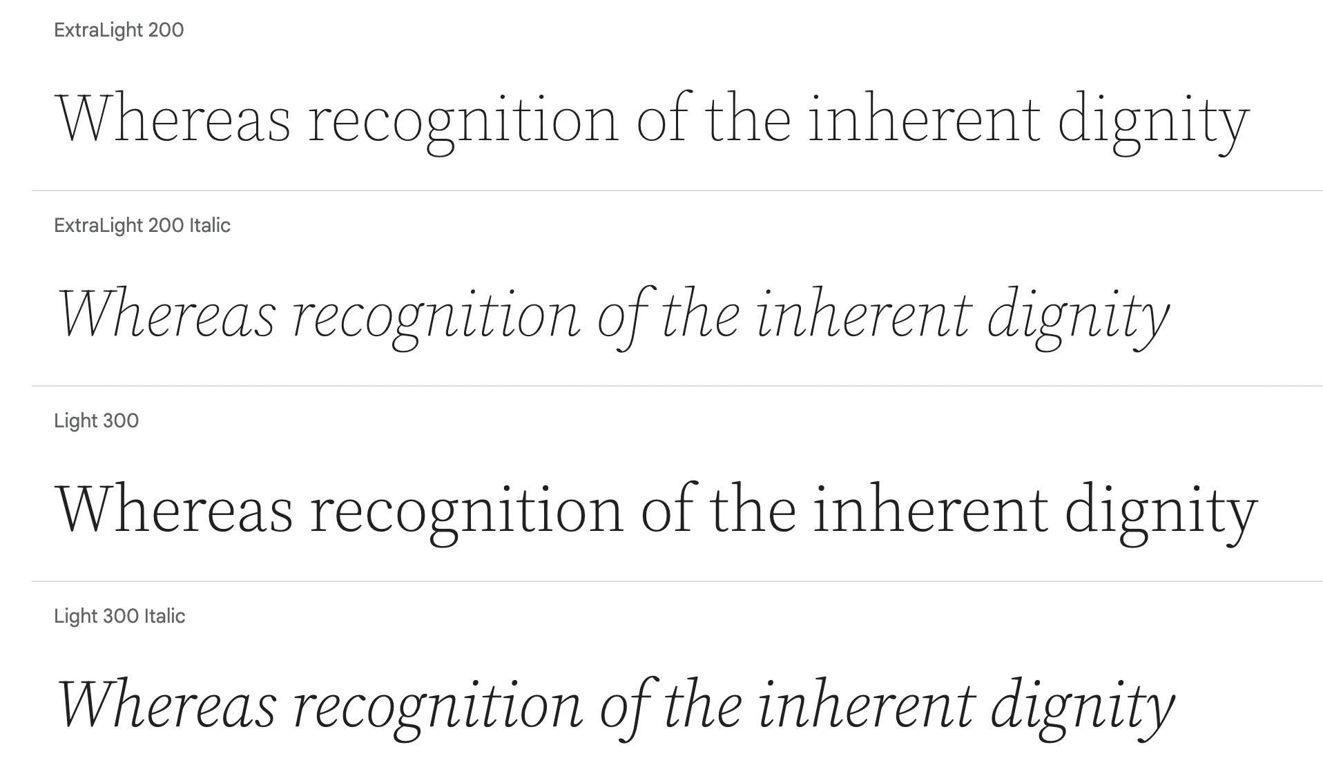
This screenshot from Google Fonts shows various combinations of different weights and slopes in Source Serif 4. The more available weights, the more combination of styles you’ll be able to use.
Before ending the post, I’d like to briefly talk about variable typefaces. Variable typefaces are a step forward in flexibility, as they allow you to manually adjust their weight, slant and/or width within a certain range. So instead of having fixed weights such as 200 (ExtraLight) or 400 (Regular), it’s possible to use values such as 203 or 350. The same applies to the slant and the width. As a result, they give you more control over their visuals. However, not all typefaces may be variable in all these features. For example, Source Serif 4 only has variable weight.
If you’re interested in reading more about variable fonts, Elliot Jay Stocks has written an article for Google Fonts, which includes examples of variable fonts.
Featured image credits: Sprinter_Lucio at Pixabay.

