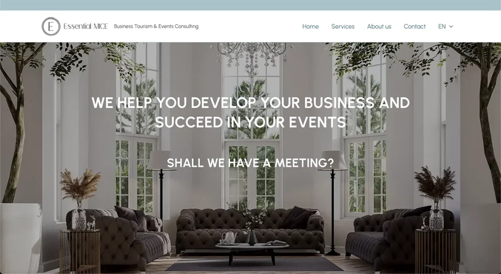
Essential MICE
Context
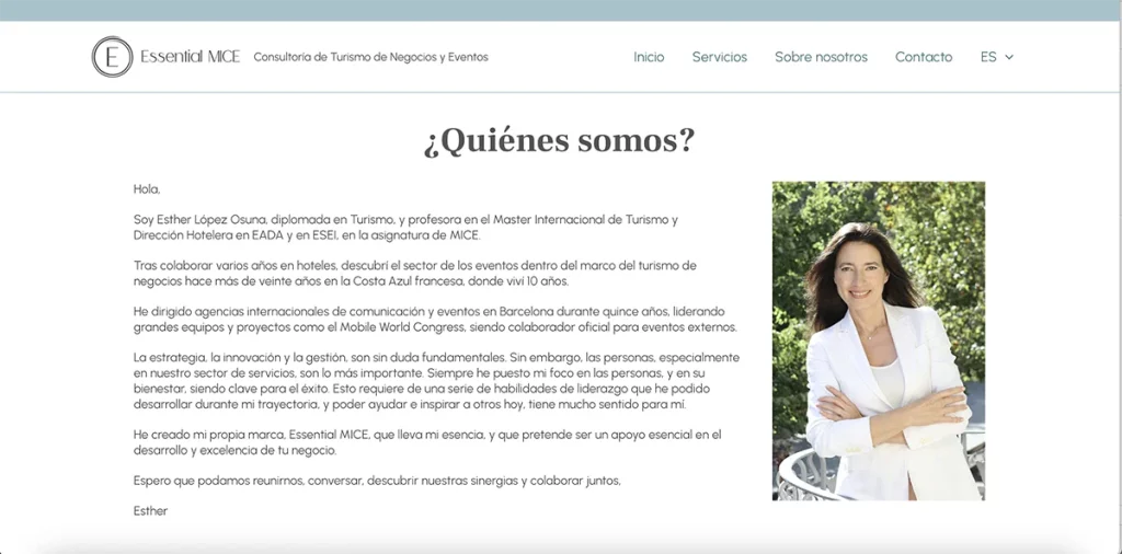
Esther has a degree in Tourism worked for several years for different hotels. At one point, she started working in the events industry within the business tourism sector. After a while, she decided to start her own brand, Essential MICE, a consulting firm that focuses on business tourism and events. She contacted me because she needed a website to present her services.
By the way, in case you’re wondering, MICE stands for Meetings, Incentives, Conferences & Exhibitions.
Proposed Solution
Esther had a very clear idea from the start of what her website should be like. She knew what she liked and didn’t like, and how it had to be structured.
In particular, some key points were:
- Inviting but sophisticated look
- Texts would, in general, be short
- Simple structure
She provided me some hand-made wireframes (or drafts) of how she wanted each section to look like, and she also sent a colour palette which I then worked into the website. I created the designs using WordPress and customising them with CSS code where necessary. I also chose the typographies, adjusted their sizes and chose the colours from the palette provided by her.
Although the final result may look simple, it isn’t. The design was custom-made, and it had to be tweaked to work properly in mobile screens (tablets and smartphones). You can read more about the technical challenges below.
Technical Challenges
This project offered several challenges:
- Esther wanted each section to occupy 100% of the viewport (that is, the whole height of the screen). This requires finding the right balance between content and blank spaces, and ensuring that it looks right in different devices.
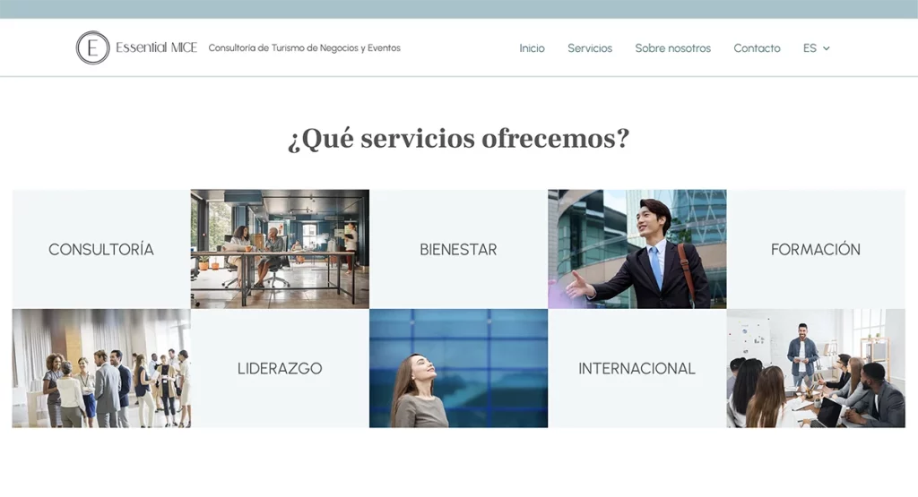
- She also wanted a grid showing listing her services. Although it looks simple, I had to put in a lot of work in order to get a grid that:
- Fills 100% of the height of the screen
- Looks right and can be readable in smaller screens
- Stacks correctly in mobile devices, with images and service titles showing in the right order
- As the website wasn’t content-heavy, we chose to go with a one-page implementation. This created its own challenges, as some contents required their own page (e.g. cookies policy, legal notice, etc.) and this created issues with the menu.
- I tried different implementations of the service descriptions (the service names in the grid are clickable), and in the end we went with a pop-up like solution.
- The main reason behind this is that Esther wanted each service description to fill the screen. A pop-up is a nice way to do so, that makes sense in the context of websites. On the other hand, if service descriptions were placed in a single page, one after the other, the reader could get the impression that there was no more content to be read, specially in bigger screens or those with higher resolutions.
- As a bonus, this implementation also solved a technical issue that had to do with automatic scrolling.
Benefits
Esther’s main goal was to have a website for her newly-created business, which she could use to introduce herself and her services to her potential clients. She also wanted to be able to easily change the texts or images if she needed to.
Although these are the main benefits, the website also:
- Complies with the GDPR
- It is backed up regularly to a remote server, so that in the event that something goes very wrong, the data can be recovered.
- Contact forms can sometimes stop working if the server blocks the sending of e-mails. In order to avoid any issues, the website stores any sent forms so that they are never lost.